


How to Read Stock Charts and Market Trends on PSX
A stock chart can look like a heartbeat monitor: a jagged line rising and falling, with volume bars underneath and a row of technical indicators nearby. For a new Pakistan Stock Exchange (PSX) investor, it is tempting to imagine that if you could decode the squiggles, you would know what happens next.
The more useful truth is simpler: a chart shows how a price has behaved over time. It does not predict the future. It is a record, not a fortune-teller.
Once you read charts that way, they become genuinely useful for spotting trends, judging how actively a share trades, and asking better questions before you act. This guide walks through reading PSX charts step by step, using Investify stock pages as the practical workflow.
Key takeaways
- A chart is descriptive, not predictive. It shows past price behaviour, not guaranteed future direction.
- Start with the timeframe. The same stock can look very different on 1D versus 1Y.
- Volume gives price context. A move backed by high volume reflects broader participation; a thin-volume move involves fewer trades.
- Trends and day range help you understand the lay of the land: uptrend, downtrend, sideways movement and today's trading band.
- Technical indicators such as RSI, STOCH, MACD, moving averages and pivots add context, but none is a buy or sell signal by itself.
- Charts work best combined with fundamentals, PSX announcements, news, liquidity and risk checks. Investify is a research and tracking app, not a broker.
What a PSX stock chart actually shows
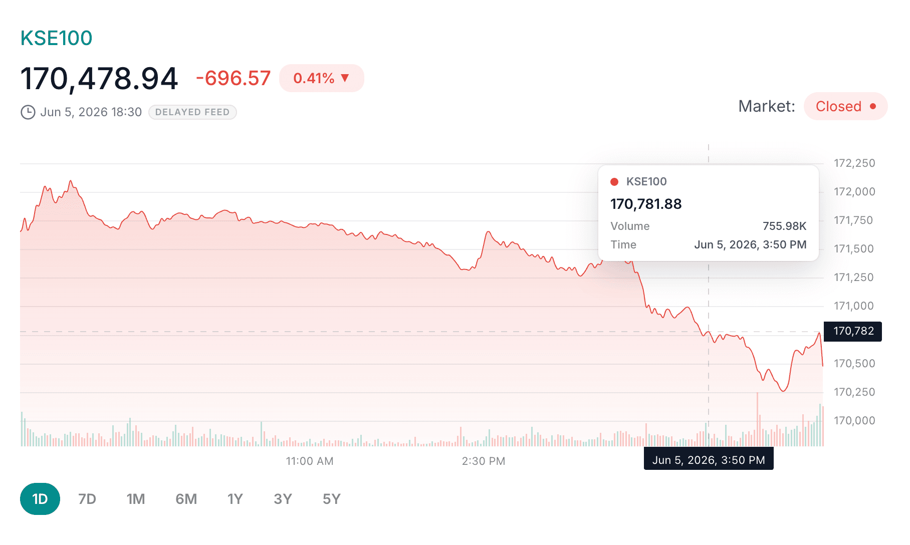
At its core, a stock chart plots price on the vertical axis against time on the horizontal axis. Each point shows what the share traded at during that moment, so the line or candles trace the company's price journey. Beneath the price, most charts show volume bars, which tell you how many shares traded in each period.
That is the base: price over time, plus how busy the trading was. Everything else, including trends, ranges and indicators, is a way of interpreting that information.
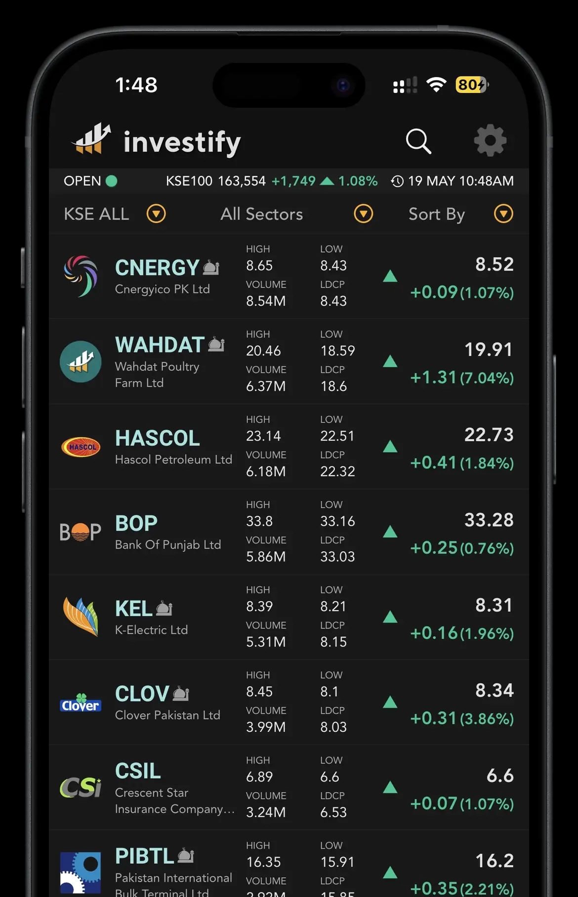
On Investify, you can see this on a company's quote page by opening examples such as HBL, MEBL or OGDC. The page brings together the live price, change, timestamp, chart, volume and broader quote context. These are neutral examples to show the workflow, not recommendations.
Start with the selected timeframe
Before reading anything into a chart, check which timeframe you are looking at, because it completely changes the story. A share can look like it is falling sharply on a 1D chart while still being in a steady year-long climb on a 1Y chart. Same company, different zoom level.
Think of it like a map: zoom all the way in and you see one street; zoom out and you see the whole city. Neither view is wrong, but you need to know which one you are using before drawing conclusions.
How to use Investify chart periods: 1D, 7D, 1M, 6M, 1Y, 3Y and 5Y
Investify charts support several periods, each suited to a different question.
| Investify period | What it helps you see | Beginner caution |
|---|---|---|
| 1D | Today's intraday movement and current-session behaviour | Mostly short-term noise; easy to overreact to small swings |
| 7D | The past week's behaviour | Still very short; one week rarely proves a durable trend |
| 1M | The last month's direction and recent swings | Can mislead if the month was unusually calm or volatile |
| 6M | A medium-term view of where the price has been heading | Does not capture full-year seasonality or longer cycles |
| 1Y | The one-year trend and broad up/down picture | One year can still be dominated by one big event |
| 3Y | Multi-year direction through different market conditions | Older patterns may not reflect the company today |
| 5Y | Long-term trajectory across broader market cycles | Recent changes can get visually compressed |
A practical habit is to look at a long period first such as 1Y or 3Y to understand the overall trend, then a shorter one such as 1M or 7D to see what is happening lately. The combination is more useful than relying on one zoom level.
Reading the price line or candle movement
The price line connects where the share traded over your chosen period. A rising line means the price climbed; a falling line means it dropped.
Some charts use candlesticks instead of a simple line. Candles pack in more detail for each period: usually open, high, low and close. For beginners, you do not need to memorise candle patterns. Start with the overall shape: is the price generally drifting up, down or sideways over the period?
That single observation is more useful than forcing a meaning onto every small candle.
Why volume bars matter
Volume, the bars beneath the price, tells you how many shares traded. A useful way to think about it: price tells you what happened; volume tells you how many people were involved.
A price jump on heavy volume means many participants traded during that move. The same jump on very thin volume may come from only a handful of trades, which can reverse more easily. Volume is also a liquidity clue: actively traded shares are usually easier to buy and sell near quoted prices.
Uptrend, downtrend and sideways market: what beginners should notice
Most price action falls into one of three broad shapes:
- Uptrend: the price makes generally higher peaks and higher troughs over time.
- Downtrend: the price makes generally lower peaks and lower troughs over time.
- Sideways or range-bound: the price moves within a band without a clear up or down direction.
What beginners should notice is the overall direction over a sensible timeframe, not a perfect textbook definition. Trends can begin, continue, weaken and reverse. Spotting the current trend gives context; assuming it will continue forever is the trap.
Day range, explained simply
The day range is the lowest and highest price a share has traded at during the current session. It tells you how wide today's move has been.
For example, if a share opened calmly but later dropped sharply, the day range helps you see that today's movement was wider than the last traded price alone suggests. It is useful intraday context, not a forecast.
Support and resistance, explained simply
Support is a price area where a share has repeatedly stopped falling and tended to bounce, as if buyers often show up there. Resistance is the opposite: an area where the share has repeatedly struggled to rise above, as if sellers appear.
The crucial caveat is that support and resistance are tendencies, not walls. They can break, especially on material news or heavy volume. Treat them as areas of interest where price has reacted before, never as guarantees.
Using Investify's Technicals tab: RSI, STOCH, MACD, pivots and moving averages
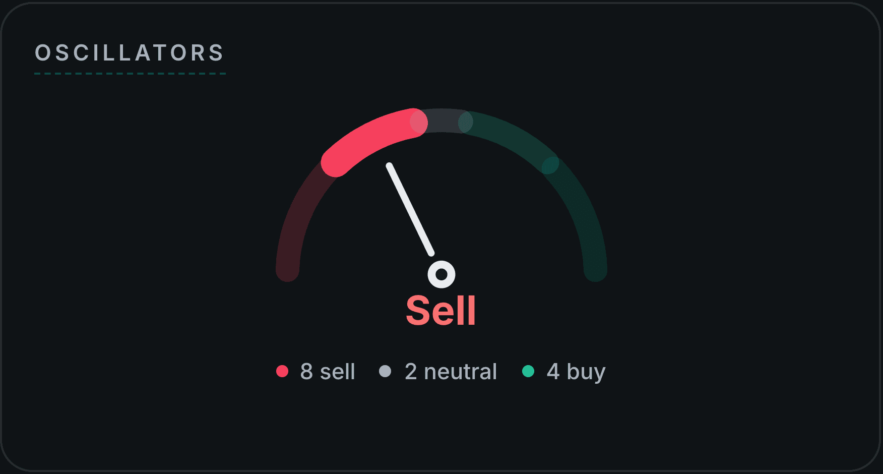
Beyond the price chart, Investify has a Technicals tab, for example HBL technicals, that shows momentum indicators and reference levels. None of these is a buy or sell signal on its own. For a full card-by-card walkthrough of that dashboard, including the buy/sell/neutral verdict gauges, see how to read the Technicals tab on Investify.
- RSI (Relative Strength Index): a momentum gauge from 0 to 100. Readings near the 70 zone are often described as overbought and near 30 as oversold. These are only stretched-momentum zones; strong trends can keep RSI high or low for a long time.
- STOCH (Stochastic): compares the recent closing price to the recent high-low range. It can show momentum, but it can also remain stretched in strong trends.
- MACD (Moving Average Convergence Divergence): compares moving averages to show momentum shifts. Crossovers and histogram changes are context, not certainty.
- Moving averages: smooth out the jagged price line to help show trend direction. They lag because they are based on past prices.
- Pivot points, support and resistance levels: calculated reference levels traders watch for potential turning areas. They can break and should not be treated as guarantees.
Why charts should be checked with fundamentals, announcements and news
A chart can show you that a price moved. It usually cannot tell you why. The why lives in the company's fundamentals, PSX announcements, corporate actions, results, dividends and market news.
A price spike might be driven by strong earnings, a dividend announcement, a rumour, a sector move or a one-off liquidity event. The chart alone does not distinguish between them.
This is why chart-reading should be one input, not the whole decision. Pair the chart with company fundamentals, recent PSX announcements, news, volume, liquidity and your own risk limits. Charts plus context beats charts alone.
A simple beginner chart-reading routine on Investify
Here is a calm routine you can follow on an Investify stock page:
- Open the stock page such as OGDC and note the current price, change and timestamp.
- Zoom out first using 1Y or 3Y to read the overall trend.
- Zoom in using 1M and 7D to see recent movement.
- Glance at volume to check whether recent movement was active or thin.
- Check the day range to understand today's trading band.
- Open the Technicals tab for momentum context such as RSI, MACD and moving averages.
- Read announcements and news to understand why the price may be moving.
- Add it to a watchlist and track it over time instead of deciding in a single glance.
Use Investify for your daily PSX workflow
Open market data, stock pages, charts, news, announcements, watchlists and portfolio tracking from one Investify account.
Open PSX chartsCommon chart-reading mistakes beginners should avoid
| Mistake | Why it misleads | Better habit |
|---|---|---|
| Chasing a sudden spike | A spike may be noise or a one-off move | Check volume, news and the longer trend before reacting |
| Ignoring volume | A move on thin volume involves fewer traders | Always read price moves alongside volume |
| Using only one timeframe | One zoom level hides the bigger or smaller picture | View a long and a short period together |
| Treating RSI or MACD as guarantees | Indicators describe momentum, not certainty | Use indicators as context with fundamentals and news |
| Ignoring PSX announcements | The chart shows what happened, not why | Check announcements and filings before acting |
| Confusing short-term moves with long-term trend | A bad day is not automatically a downtrend | Judge trend over a sensible, longer timeframe |
| Treating support or resistance as walls | These levels can break, especially on news | Use them as areas of interest, not certainties |
Quick reference: chart elements and how to use them
| Chart element | What it means | How to use it carefully |
|---|---|---|
| Price line or candles | Price movement over the selected period | Read the overall shape before focusing on tiny moves |
| Volume | Number of shares traded | Use it to judge participation and liquidity, not company quality |
| Day range | Today's low and high | Useful for intraday context only |
| Support and resistance | Areas where price has reacted before | Treat as reference zones, not walls |
| Moving averages | Smoothed trend lines | Remember they lag past price |
| RSI | Momentum gauge | Do not treat 70/30 zones as automatic signals |
| MACD | Momentum and moving-average relationship | Crossovers are context, not certainty |
| Pivots | Reference levels some traders watch | Levels can break quickly on news or heavy volume |
Educational note
This article is for general education only. It explains how to read Pakistan Stock Exchange charts and indicators. It is not investment, financial, legal or tax advice, it does not promise returns, and it does not recommend buying or selling any security.
Chart patterns and technical indicators such as RSI, STOCH, MACD, moving averages and pivot points describe past and present price behaviour and do not guarantee future performance. Company symbols mentioned are neutral examples. Market data and rules can change over time, so verify current information from official sources and consult a qualified professional for personal financial matters.
The bottom line
Reading PSX charts well is not about predicting the future. It is about understanding the present more clearly. Know your timeframe, read price alongside volume, recognise the broad trend and day range, and treat indicators like RSI and MACD as context rather than commands.
Above all, pair the chart with fundamentals, PSX announcements, news, liquidity and your own risk limits. Use Investify stock pages and the Technicals tab to research, and use watchlists and portfolio tools to track over time. Actual trades should go through your licensed broker.
Related reading
Sources and references