


How to Read the Technicals Tab on Investify
Open any stock page on Investify, for example HBL or OGDC, and click Technicals. You get a dashboard: three verdict gauges at the top, then cards named Price Levels, Standouts, Volume, Oscillators, Moving Averages and Volatility & Bands, full of numbers, coloured dots and sliding scales.
It can look like a cockpit built for professionals. It is not. Every element on that page answers one of a handful of simple questions: which way is the trend, how strong is the momentum, where does the price sit in its recent range, how busy is the trading, and how wild are the swings. Once you know which card answers which question, and what each indicator inside it actually measures, the whole tab takes about a minute to skim and rewards you every time you look closer.
This guide goes through the page section by section, in the order it appears on screen, and explains every indicator on it: what it measures, how it is calculated in plain terms, how Investify turns it into a buy, sell or neutral read, and where it misleads beginners.
Key takeaways
- The verdict gauges at the top are vote counts drawn as dials, not recommendations. Around 32 indicators each cast a buy, sell or neutral vote, and the needles show the balance.
- Everything is computed on the last daily close (the summary shows the date), so the verdicts are stable rather than ticking with the live price.
- Oscillators measure momentum, Moving Averages measure trend, Price Levels shows where price sits, Volume shows participation and Volatility & Bands shows swing size.
- The Standouts card does the scanning for you: it lists up to five unusual facts about the stock today, stated as context, never as instructions.
- The gauges can disagree with each other, and that tension is often the most useful thing on the page.
- No verdict here is a buy or sell instruction. Pair the technicals with fundamentals, PSX announcements and news. Investify is a research and tracking app, not a broker.
A real example to read along with
Throughout this guide we will use one real snapshot of CNERGY (Cnergyico PK Ltd), captured after a strong session in July 2026, and every screenshot below comes from that same day. On that day its Technicals tab showed:
- Overall: Buy (8 sell, 2 neutral, 22 buy)
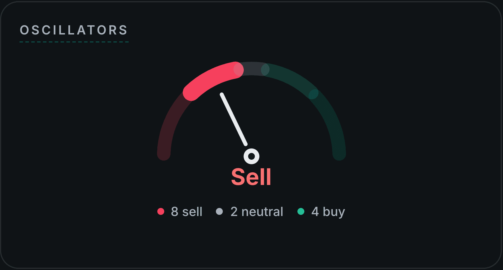
- Oscillators: Sell (8 sell, 2 neutral, 4 buy)
- Moving Averages: Strong Buy (0 sell, 0 neutral, 18 buy)
Notice something odd? The overall read was Buy, yet the oscillators said Sell. That is not a bug. It is the page telling a story, and by the end of this guide you will be able to read it. CNERGY is a neutral example chosen because the snapshot happened to be instructive, not a recommendation, and the numbers you see on the live page today will differ.
The Technical Summary: three gauges and a vote count
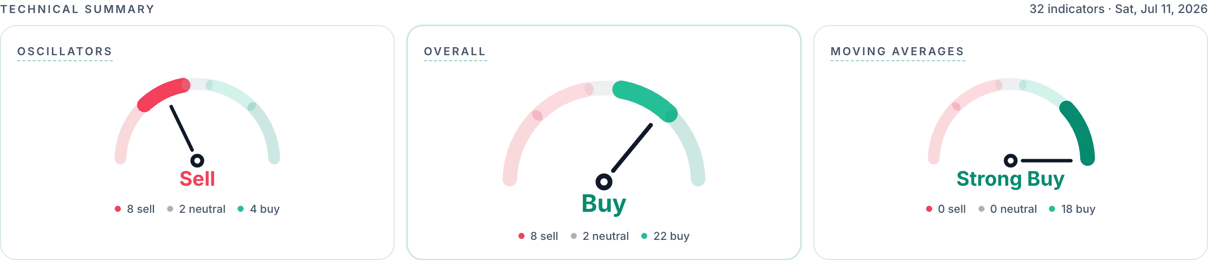
The strip at the top is labelled Technical Summary, with a note like "32 indicators · Sat, Jul 11, 2026". That note tells you two things: how many indicators voted, and which trading day the data reflects. The three gauges are:
- Oscillators (left): the tally of the momentum indicators.
- Overall (centre, the main dial): all voters combined.
- Moving Averages (right): the tally of the trend lines.
Each gauge is a dial that sweeps from Strong Sell on the far left, through Sell, Neutral, Buy, to Strong Buy on the far right. The needle points at the current verdict, the red-to-green arc segment shows which band it landed in, and the counts underneath ("8 sell · 2 neutral · 22 buy") give you the raw vote so you never have to trust the word alone. A landslide and a narrow split can produce the same word; the counts tell you which one you are looking at.
How a vote is cast
Every voting indicator has a standard, published rule. RSI above 70 votes sell and below 30 votes buy. A price above its 50-day average votes buy for that line, below votes sell. MACD above its signal line votes buy, below votes sell. Nothing subjective happens anywhere: each of the 32 voters applies its own textbook threshold to the latest daily close, and the result is a pile of buy, sell and neutral votes.
How votes become a verdict
The verdict comes from the net balance of the votes: buy votes minus sell votes, divided by the total number of voters. A score near zero (within about ±0.1) reads Neutral. Beyond that it becomes Buy or Sell, and beyond about ±0.5 it becomes Strong Buy or Strong Sell. You can check this against the CNERGY snapshot:
- Overall: (22 − 8) ÷ 32 ≈ +0.44 → solidly in the Buy band, but short of Strong Buy.
- Oscillators: (4 − 8) ÷ 14 ≈ −0.29 → Sell, but not Strong Sell.
- Moving Averages: (18 − 0) ÷ 18 = +1.0 → as strong as the scale goes: Strong Buy.
A few gauges on the page show context but deliberately do not vote. ADX measures how strong a trend is, not which way it points, so it stays neutral in the count. The trailing stops (Parabolic SAR and SuperTrend) are also shown for reference only. That keeps the tally honest.
Reading the CNERGY example: the Moving Averages gauge was a unanimous 18-for-18 Strong Buy, meaning the price sat above every single tracked average. That is what a powerful uptrend looks like. But the Oscillators gauge leaned Sell, because after a sharp rally the momentum gauges were deep in overbought territory. Combined: a strong uptrend that had run hot in the short term. Neither gauge alone tells that story; together they do.
Price Levels: where the price sits
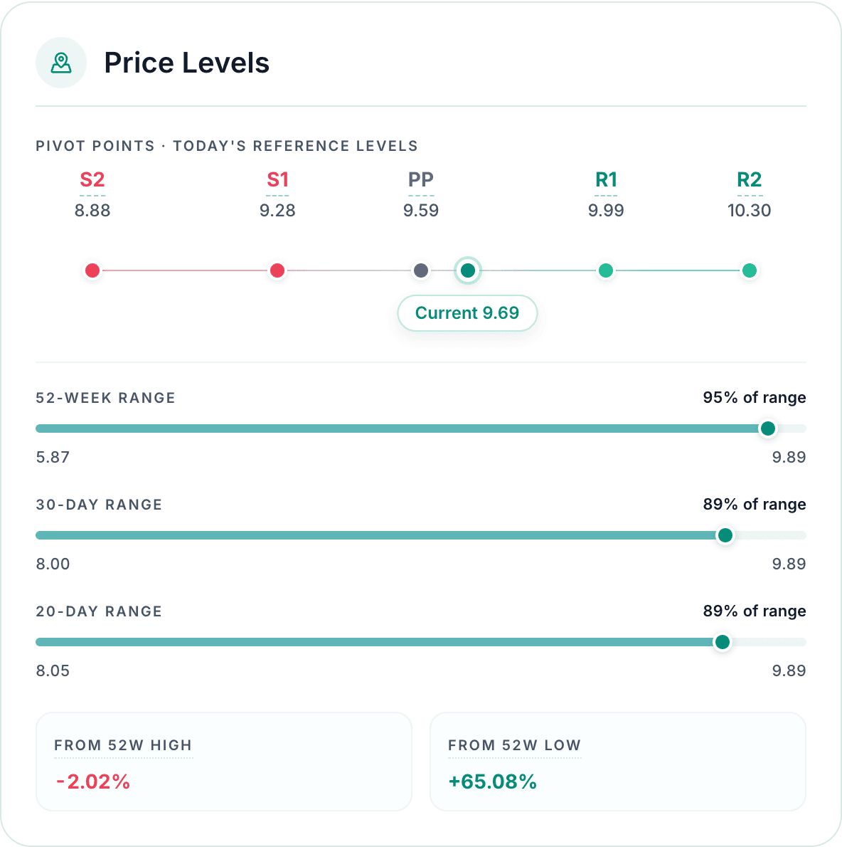
The first card maps the price against its reference points, in two halves.
The pivot ladder: S2, S1, PP, R1, R2
Pivot points are the oldest tool on the page, dating back to floor traders who needed quick reference levels for the day. They are computed from the previous session's high, low and close:
- PP (pivot point) = (high + low + close) ÷ 3
- S1 = 2 × PP − high, and R1 = 2 × PP − low
- S2 = PP − (high − low), and R2 = PP + (high − low)
You can verify this with the snapshot: CNERGY's previous session ran 9.18 to 9.89 and closed at 9.69, so PP = (9.89 + 9.18 + 9.69) ÷ 3 ≈ 9.59, S1 = 9.28, R1 = 9.99, S2 = 8.88, R2 = 10.30, exactly the ladder in the screenshot.
The idea: PP is a fair-value anchor for the day, the S levels are areas where falls have tended to pause (support), the R levels where rallies have tended to stall (resistance). The rail shows where the current price sits on the ladder; CNERGY at 9.69 sat between the pivot and first resistance, consistent with a stock pushing upward.
Trading ranges and 52-week distance
- 52-week, 30-day and 20-day ranges: each rail shows the lowest and highest traded price over that window and where the current price sits inside it, as a percentage. CNERGY read "95% of range" on the 52-week rail: trading near the very top of its yearly band. A stock at 10% of its 52-week range lives in a completely different situation from one at 95%, even if both closed up today.
- From 52W high / From 52W low: the same idea as two plain numbers. CNERGY sat 2.02% below its 52-week high and 65.08% above its 52-week low.
Treat pivots and range edges like the support and resistance zones on a chart: areas of interest, not walls. They break, especially on news or heavy volume.
Standouts: the page reads itself for you
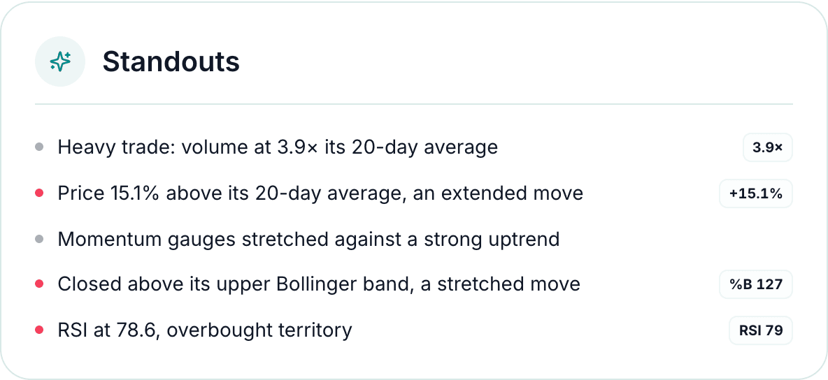
If you only have ten seconds, read this card. Standouts scans the day's numbers against a fixed set of "is this unusual?" rules and surfaces at most five, ranked by importance. Each line carries a tone dot (green for bullish, red for bearish, grey for neutral) and, where useful, a metric chip.
The full set of things it watches for:
- Unusual volume: volume at 1.5× or more its 20-day average ("busier than usual"), 2.5× or more ("heavy trade"), or 0.4× or less ("quiet session").
- RSI extremes: overbought above 70, deeply overbought above 80, oversold below 30, deeply oversold below 20.
- Momentum against trend: the oscillator and moving-average verdicts pointing hard in opposite directions, in either direction ("momentum gauges stretched against a strong uptrend", or "turning up against a strong downtrend").
- 52-week extremes: a new 52-week high, trading within 2% of the high, or sitting at the bottom of the yearly range.
- Bollinger pierces: a close above the upper band or below the lower band (a statistically stretched or washed-out move).
- A volatility squeeze: the Bollinger bands narrowing sharply versus the previous day, the classic calm that sometimes precedes a storm.
- An extended price: the price 10% or more away from its own 20-day average, in either direction.
- Full sweep of the averages: trading above, or below, every tracked moving average at once.
- A very strong trend: ADX at 40 or above, with the DI lines saying whether it is an uptrend or a downtrend.
- A trend inflection zone: the 50-day and 200-day averages converging within 1% of each other, the area where golden and death crosses form.
In the CNERGY snapshot the card fired all five slots: heavy volume at 3.9×, a 15.1% extension above the 20-day average, momentum stretched against a strong uptrend, a close above the upper Bollinger band at %B 127, and RSI at 78.6. Notice the third line: it is exactly the tension we saw in the summary gauges, spelled out in a sentence.
Volume: how busy the trading is
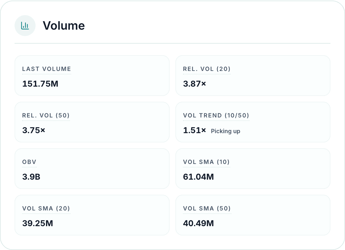
Price tells you what happened; volume tells you how many market participants were involved. The Volume card turns the raw number into comparisons you can actually use:
- Last volume: shares traded in the latest session. On its own this means little; 150M shares is enormous for one company and routine for another. Everything else on the card gives it context.
- Rel. Vol (20) and Rel. Vol (50): the latest volume divided by its own 20-day and 50-day average. This is the single most useful volume number. 1× is a perfectly normal day. Around 1.5× is busier than usual, 2.5× and above is heavy, and 0.4× or below is a quiet drift. CNERGY's 3.87× says almost four times the usual number of shares changed hands: whatever happened, the market showed up for it.
- Vol trend (10/50): the average volume of the last two weeks versus the longer 50-day norm, with a plain label. "Picking up" (CNERGY read 1.51×) means interest has been building for days, not just today; a fading ratio means attention is draining away.
- OBV (On-Balance Volume): a running total that adds the day's volume when the stock closes up and subtracts it when it closes down. The absolute number (CNERGY's 3.9B) means nothing by itself; its direction over time is the point. Rising OBV suggests money has been flowing in on up days; falling OBV, out on down days.
- Vol SMA (10/20/50): the plain average daily volumes. Beyond feeding the ratios above, they are a liquidity check: a stock averaging 40M shares a day is easy to enter and exit near quoted prices; one averaging 50 thousand is not.
Why care so much? Because volume is the credibility filter for everything else on the page. A breakout to a 52-week high on 4× volume and the same breakout on 0.3× volume are entirely different events, even though every price-based indicator reads identically.
Oscillators: momentum, indicator by indicator
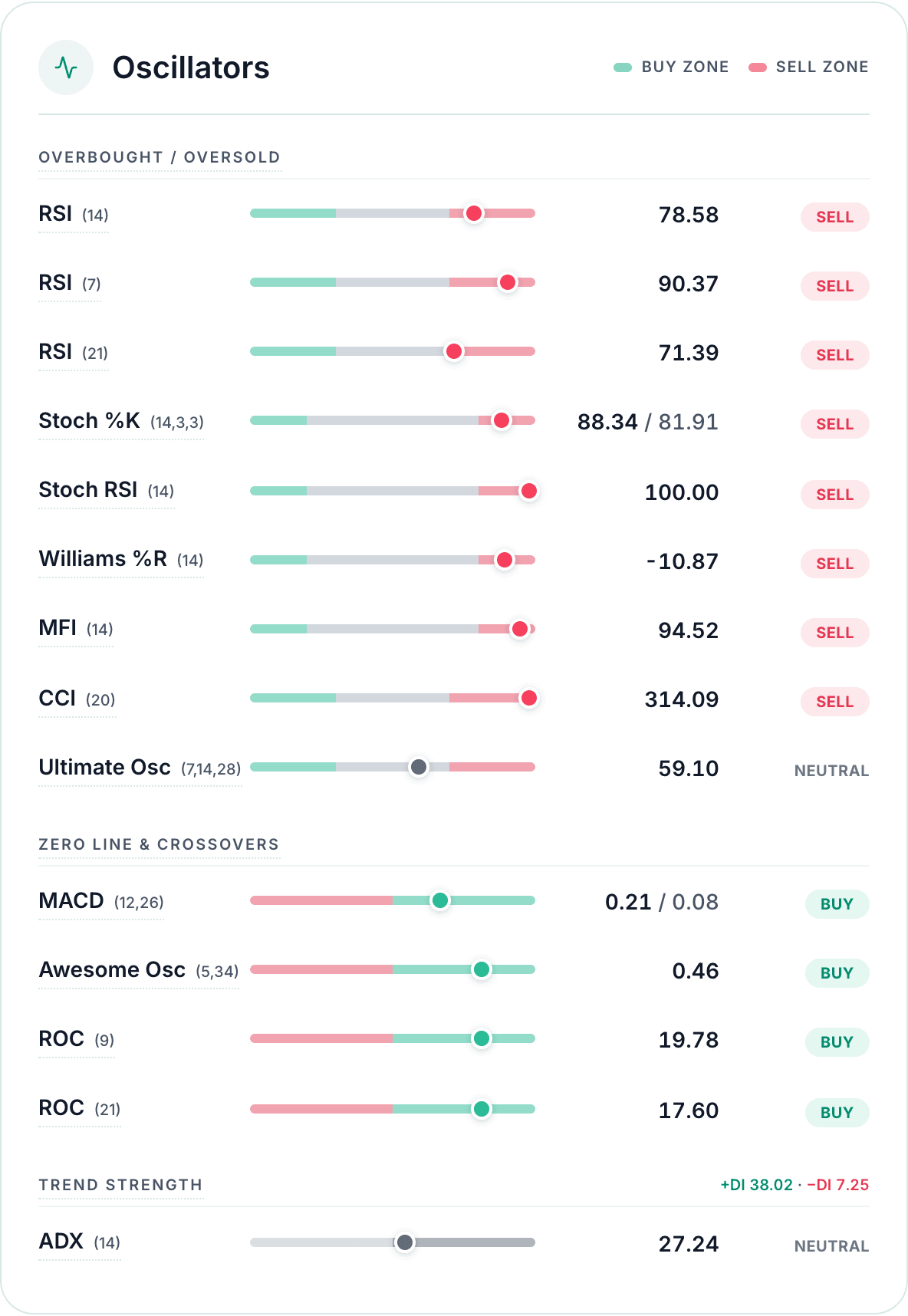
Oscillators measure momentum: how fast and how far price has moved recently. Each row shows the indicator's name and settings, a rail with a green buy zone at one end and a red sell zone at the other, a dot for the current reading, the value itself, and its vote. Hover any indicator name on the page for a built-in definition.
The card groups the rows by the question they answer, and it is worth understanding each indicator on its own terms.
Overbought and oversold: how stretched is the price?
RSI (Relative Strength Index), 14 sessions. The most-watched momentum gauge in the world. It compares the size of recent up-moves against recent down-moves and squeezes the result onto a 0 to 100 scale. If every one of the last 14 sessions closed higher, RSI approaches 100; all lower, it approaches 0. Readings above 70 are called overbought (the rally has been fast and one-sided; votes sell), below 30 oversold (the sell-off has been fast and one-sided; votes buy). In between, it simply says momentum is unremarkable. CNERGY's 78.58 was firmly overbought.
RSI (7) and RSI (21). The same formula on shorter and longer windows. The 7-session version reacts sooner but whipsaws more (CNERGY's was at a scorching 90.37); the 21-session version smooths the noise and reflects the broader swing (71.39, just past the overbought line). When all three agree, as here, the reading is robust; when only the 7 is stretched, the move is very recent.
Stochastic %K (14,3,3). Asks a slightly different question: where did the price close relative to its own high-low range of the last 14 sessions? Closing near the top of the range pushes %K toward 100; near the bottom, toward 0. The second number shown is %D, a 3-session average of %K that acts as its signal line. Above 80 counts as overbought, below 20 oversold. CNERGY's 88.34 / 81.91 says it kept closing near the top of its recent range.
Stoch RSI (14). A stochastic reading applied to the RSI itself rather than to price. Because it is an indicator of an indicator, it saturates much faster and flags short-term turns earlier, at the cost of more false alarms. It pegs at 0 or 100 easily; CNERGY's read exactly 100.00.
Williams %R (14). The stochastic's mirror image, on a −100 to 0 scale: above −20 means closing near the recent highs (overbought), below −80 near the lows (oversold). It adds no new information over the stochastic; it is shown because many traders grew up reading this scale. CNERGY: −10.87, overbought.
MFI (Money Flow Index), 14 sessions. A volume-weighted RSI. Instead of asking only "did price rise?", it asks "how much money moved on the days it rose versus the days it fell?" by multiplying each day's typical price by its volume. That makes it stricter than RSI: a rally on thin volume will not push MFI far. Above 80 overbought, below 20 oversold. CNERGY's 94.52, achieved on heavy volume, confirms the rally was not thin.
CCI (Commodity Channel Index), 20 sessions. Measures how far the current price has stretched from its own 20-session typical average, scaled by how much it normally deviates. Beyond +100 counts as overbought, below −100 oversold, and readings beyond ±200 are rare. CNERGY's 314.09 was an exceptional statistical stretch, several times the stock's normal wander from its average.
Ultimate Oscillator (7, 14, 28). Blends buying pressure across three windows, short, medium and long, into one 0 to 100 reading, precisely so that a single sharp spike cannot skew it. That built-in patience is why, on a day when every fast gauge screamed, it sat at a calm 59.10 and voted neutral.
Zero line and crossovers: is momentum positive or negative?
MACD (12, 26). The Moving Average Convergence Divergence takes a fast 12-session exponential average of price, subtracts the slow 26-session one, and watches the gap. When the fast average pulls above the slow one, momentum is building; below, fading. The second value shown is the signal line, a 9-session average of the MACD itself, and the vote reads off the crossover: MACD above its signal line votes buy, below votes sell. CNERGY's 0.21 / 0.08 meant the gap was wide and still positive: momentum firmly up. MACD is slower than RSI but far less jumpy, which is why the two so often disagree at turning points.
Awesome Oscillator (5, 34). Compares a very fast 5-session and a slow 34-session average of each session's midpoint (halfway between the high and low). Above zero, recent momentum runs ahead of the bigger wave (votes buy); below zero, behind it (votes sell). CNERGY: +0.46.
ROC (9) and ROC (21). Rate of Change is the simplest indicator on the card: the percentage change versus 9 or 21 sessions ago, full stop. CNERGY was up 19.78% on 9 sessions earlier and 17.60% on 21 sessions earlier. Positive votes buy, negative votes sell. Its virtue is honesty; there is nothing clever to misread.
Trend strength: one gauge that refuses to pick a side
ADX (14), with +DI and −DI. The Average Directional Index measures how strong the current trend is, not which way it points, on a 0 to 100 scale. Below about 20 the market is drifting sideways; above 25 a real trend is in force; above 40 a very strong one. The two companions in the header answer the direction question: +DI measures upward pressure and −DI downward, and whichever is larger is driving. CNERGY read ADX 27.24 with +DI 38.02 far above −DI 7.25: a genuine, established uptrend of moderate strength. Because ADX itself has no direction, it always votes neutral in the consensus.
Reading the CNERGY example: eight sell votes, all from the overbought block; four buy votes, all from the zero-line block. Translated: the rally is fast enough to stretch every short-term gauge, and it is still genuinely in force. Stretched but rising. Both true at once, and the card shows you exactly which family of gauges says which.
Moving Averages: the trend, on one shared scale
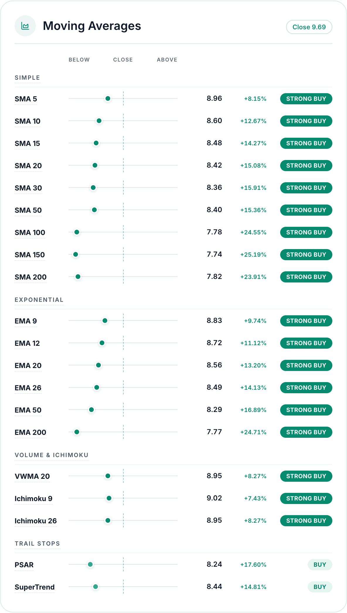
A moving average smooths the closing price over a window of sessions into one slowly bending trend line. The card lists the whole ladder, and reads every row the same way: is the current close above or below this average, and by how far? Each row shows the average's value, the percentage distance (CNERGY's close of 9.69 was +8.15% above its SMA 5 and +23.91% above its SMA 200), a dot on a shared below / close / above scale, and a graded pill. Above votes buy, below votes sell, and the pill upgrades to STRONG when the distance exceeds about 3% either way.
Because every dot sits on the same scale, the pattern is instantly readable: dots scattered on both sides mean a choppy, trendless stock; every dot on one side, as in the CNERGY snapshot, means the trend owns every timeframe at once.
Simple moving averages: the backbone
The SMA is the plain average of the last N closes, and each window has its own audience:
- SMA 5 / 10 / 15 / 20 track the last one to four weeks of trading, the territory of short-term traders. Price crossing these means little on its own; they whip around constantly.
- SMA 30 / 50 describe the medium-term swing. The 50-day is a widely watched health line for a trend; many trend-followers treat "above the 50" as the definition of an intact advance.
- SMA 100 / 150 / 200 are the long-term benchmarks. The 200-day average is the most-cited line in all of technical analysis: above it, a stock is conventionally described as being in a long-term uptrend, below it a downtrend. Institutions genuinely watch it, which gives it a self-fulfilling weight.
The relationship between the averages matters too. When the 50-day crosses above the 200-day, chartists call it a golden cross (a long-term bullish shift); crossing below is a death cross. Investify's Standouts card flags when the two converge within 1% of each other, the zone where these crosses form.
Exponential moving averages: the same idea, faster
The EMA weights recent sessions more heavily than old ones, so it bends sooner when the price turns. The trade-off is more false turns. The specific windows are conventions with history: EMA 12 and EMA 26 are the two lines inside MACD, EMA 9 is the classic signal-line window, and EMA 20/50/200 are the fast counterparts of the SMA benchmarks. Comparing the pairs is informative on its own: when EMA 50 sits well above SMA 50, recent trading has been stronger than the period average, an accelerating trend.
Volume and Ichimoku: two different lenses
- VWMA 20 is a 20-session average where each day is weighted by its volume, so heavy-volume days pull the line harder. If the VWMA sits above the plain SMA 20, the up-days carried the bigger volume, a quiet quality check on the trend.
- Ichimoku 9 and 26 are the conversion and base lines of the Japanese Ichimoku system, and they are built differently from every other line on the card: each is the midpoint of the highest high and lowest low of the last 9 or 26 sessions, not an average of closes. They answer "where is the centre of the recent battlefield?", with price above both considered bullish territory in the Ichimoku framework.
Trail stops: reference lines that follow the trend
Two rows at the bottom are not moving averages and do not vote; they are trend-following stop levels, shown because traders use them to answer "where would this trend be considered broken?"
- PSAR (Parabolic Stop and Reverse) plots a level that trails below the price during an uptrend, accelerating closer as the trend extends, and flips above the price the moment it is breached. CNERGY's PSAR at 8.24, some 17.6% below the price, marked the uptrend's trailing floor.
- SuperTrend (10, 3) draws a band three ATRs (see the next section) around the price midpoint, tightening as the move develops and flipping sides when the price closes through it. At 8.44 it told a similar story to PSAR by an independent route.
Both showed quiet "BUY"-side reads for CNERGY, meaning both trails sat below the price, consistent with the uptrend, but neither is counted in the 32-vote consensus.
Volatility and Bands: how big the swings are

The last card describes the size of the moves, not their direction. Nothing here is bullish or bearish by itself; it calibrates what "a big day" means for this particular stock.
- Bollinger Bands (20, 2σ). Take the 20-day average (the middle band, CNERGY's at 8.42), measure how much the price typically deviates from it, and draw a band two standard deviations either side (7.60 and 9.24 in the snapshot). By construction, the vast majority of closes land inside the band, so a close outside it is a statistically unusual event.
- Position in band (%B). Where the last close sits relative to the bands: 0% means at the lower band, 100% at the upper, 50% at the middle. Readings above 100% mean the close was beyond the upper band entirely (a stretched move; CNERGY's 127% is why Standouts flagged the pierce), below 0% beyond the lower band (a washed-out move).
- Band width. The distance between the bands, with the day-over-day change. Widening bands (CNERGY: +39.4%, "bands expanding") mean volatility is rising, typical mid-move. A sharp narrowing is the famous squeeze: the stock has gone unusually quiet, and quiet periods sometimes end with a large move in either direction, which is why Standouts watches for it.
- ATR (7 / 14 / 21). The Average True Range is the stock's typical daily travel in rupees, where each day's "true range" runs from the day's extremes and includes any overnight gap. CNERGY's ATR (14) of 0.34 on a 9.69 price means a normal day moves about 3.5%. This is the number that turns any plan realistic: a hoped-for 1% move is noise on this stock, and a 2% adverse day is entirely ordinary.
- Historical volatility (20D / 50D). The annualised statistical volatility of daily returns over the last 20 and 50 sessions, the same style of figure used to price options. CNERGY's 34% and 37% put it in spicy but not extreme territory; sleepy large-caps run in the teens, speculative names well above 50%.
A one-minute routine for reading the tab
Here is a calm order to read the page in, top to bottom:
- Read the three gauges together, counts included. Do Oscillators and Moving Averages agree? Agreement means momentum and trend point the same way. A split, like CNERGY's Sell-vs-Strong-Buy, usually means a trend that has run hot, or a downtrend showing early signs of life.
- Read Standouts. It has already found today's unusual facts for you.
- Glance at Price Levels. Top of the 52-week range or bottom? Near a pivot level or far from one?
- Check Volume. Is today's story backed by real participation or thin trade?
- Skim Oscillators and Moving Averages to see which specific gauges drive the votes; hover any indicator name for its definition.
- Check Volatility & Bands so you know what a normal day looks like for this stock.
- Leave the tab. Read the chart, the quote, announcements and news for the "why", then add the stock to a watchlist and follow it over time instead of deciding in one glance.
Use Investify for your daily PSX workflow
Open market data, stock pages, charts, news, announcements, watchlists and portfolio tracking from one Investify account.
Open a stock's Technicals tabWhat the Technicals tab cannot do
The tab is genuinely useful for reading trend, momentum, participation and stretch. Know its limits just as well:
- It does not predict. Every indicator is arithmetic on past prices. The gauges describe the present, not the future.
- It reflects the last daily close. The date in the summary strip tells you which one. During live hours the verdict will not tick with the price; use the Live tab for that.
- It does not know why. A rally on strong earnings and a rally on a rumour can produce identical readings. The "why" lives in company research, announcements and news.
- No gauge is a command. In the CNERGY snapshot, Overall said Buy while every fast momentum gauge was maxed out and the price was 15% above its short-term average. The page gave you all of that information; what to do with it is a decision the page cannot and does not make.
Common mistakes when reading the tab
| Mistake | Why it misleads | Better habit |
|---|---|---|
| Treating "Strong Buy" as a buy order | It is a vote tally at the last close, not advice | Use it as a starting question, then research the company |
| Reading the verdict word and skipping the counts | 17-15 and 30-2 can produce the same word | Always glance at the sell/neutral/buy split under the gauge |
| Selling because RSI is "overbought" | Momentum stays stretched through strong trends | Read overbought/oversold as "moved a lot", not a signal |
| Ignoring a gauge disagreement | The Oscillators-vs-MAs split is real information | Ask what story explains both readings at once |
| Expecting the numbers to move intraday | They are computed on completed daily data | Use the Live tab and chart for today's movement |
| Skipping the Volume card | A move on thin volume rests on few trades | Check relative volume before trusting any other card |
| Treating pivots as guaranteed turning points | Levels break on news and heavy volume | Treat them as areas of interest, not walls |
| Reading one indicator in isolation | Every gauge has blind spots by construction | Look for agreement across families of indicators |
Educational note
This article is for general education only. It explains how to read the technical analysis shown on Investify for Pakistan Stock Exchange stocks. It is not investment, financial, legal or tax advice, it does not promise returns, and it does not recommend buying or selling any security.
Technical indicators such as RSI, MACD, moving averages, Bollinger Bands and pivot points, and any consensus derived from them, describe past and present price behaviour and do not guarantee future performance. The summary verdicts are automated tallies of standard indicator readings, not personalised recommendations. CNERGY and other symbols mentioned are neutral examples, and the figures and screenshots are a snapshot from a single trading day that will not match the live page. Market data and rules can change over time, so verify current information from official sources and consult a qualified professional for personal financial matters.
The bottom line
Investify's Technicals tab is a dense page answering simple questions. The gauges tell you how roughly 32 indicators vote right now, and the counts underneath tell you how decisive that vote is. Standouts points at whatever is unusual today. Price Levels, Volume, Oscillators, Moving Averages and Volatility & Bands each answer one question: where is the price, how busy is the trade, how hot is the momentum, which way is the trend, and how big are the swings.
Read it as a well-organised summary of the past, not a forecast. The most interesting moments are the disagreements, a Strong Buy trend with Sell-leaning momentum, because they force the right question: what happens next is genuinely uncertain, so what else do I need to know? Answer that with fundamentals, announcements and news, track your candidates with watchlists and portfolio tools, and route any actual trade through your licensed broker.
Related reading
Sources and references